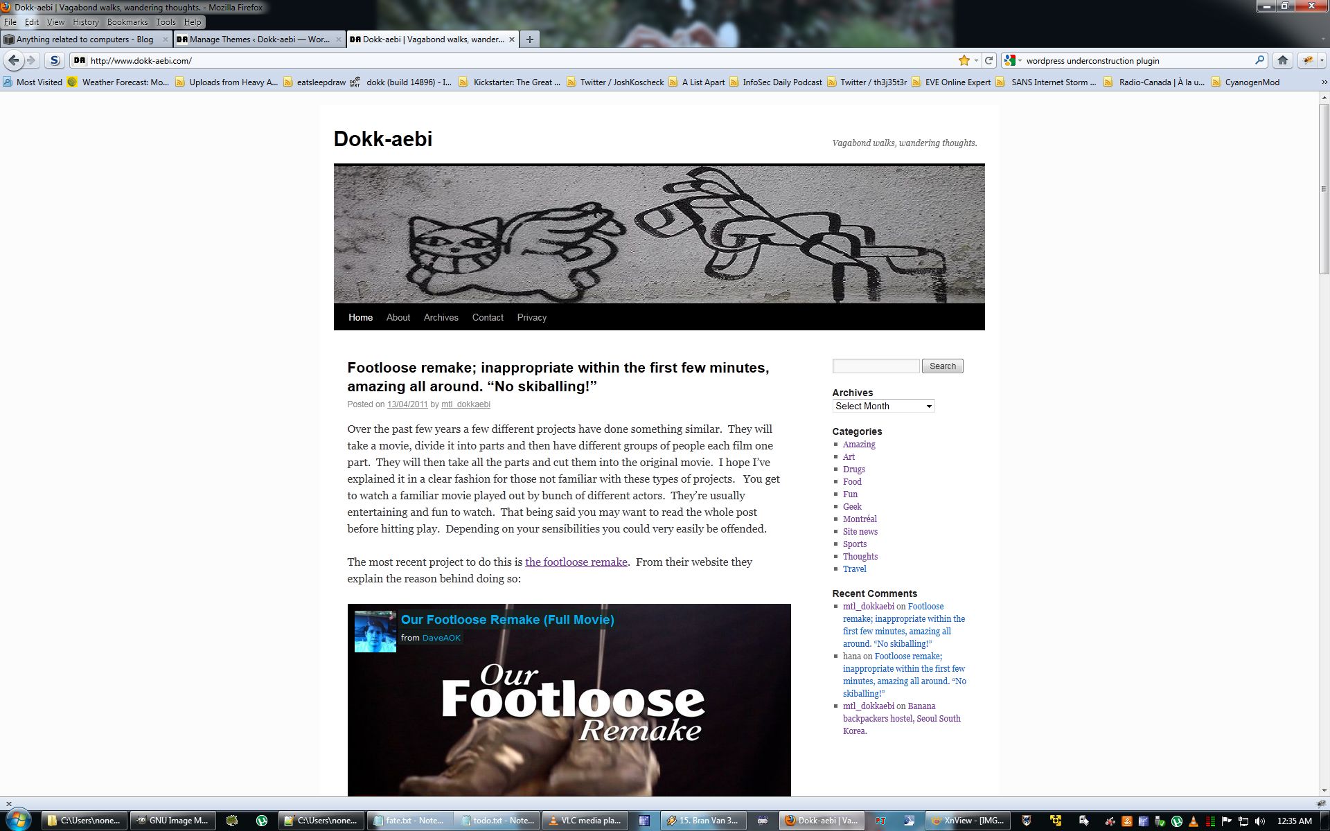
I’ve been playing with WordPress (I say playing because I’m by no means a programmer) and decided to modify the default twenty ten theme a little. I’m was going for a simple layout without too much fuss and I think I achieved my goal. There are still some things that aren’t exactly as I’d like them but I’ll tackle those at a later time. For instance the Archives page needs to be made to “look” nicer (actually it’s broken at the moment!), the site is also reverting to the “old” version when browsing by category, the individual pages are including an unnecessary title at the top of each page, the header image/logo is a little higher than I’d like and finally some of the menu colors aren’t exactly where I’d like them to be.
That being said I’m pretty happy about the new look. You can see what the site used to look like below:
I think it’s a decent hack for a few weeks of tinkering. Once I have the urge and a little spare time I’ll work on getting the last few pieces looking exactly how I want them.
mtl_dokkaebi


One Response to New design is up.